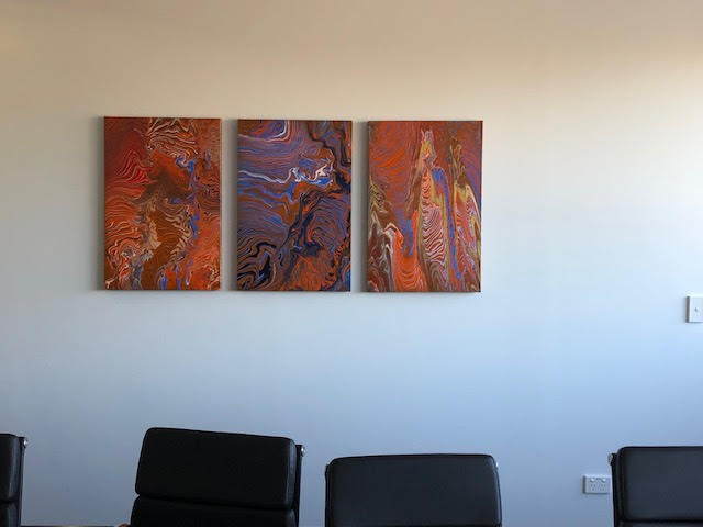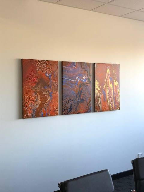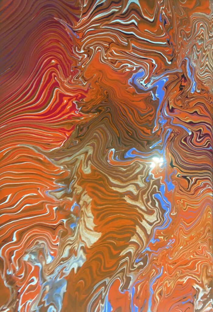
This year I took on a commission to produce something for a Corporate Boardroom for a company in Perth WA. The client didn’t know what they wanted, other than it was to contain a lot of their Corporate colours, Orange and Blue (not ideal partners on the colour wheel !), for it to be “different” and for it “to lift the room”. I played around with a number of different concept ideas for them and, as a part of this, had my very first go at acrylic pouring art.
Acrylic pouring is a fluid painting technique. Basically, you ‘condition’ regular acrylic paint with some form of medium so that it becomes pour-able … sort of the consistency of runny honey.
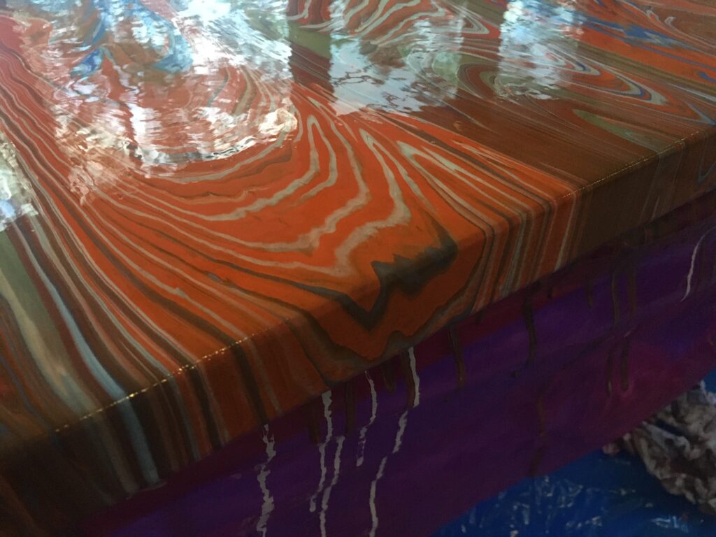
You mix or layer colours before the ‘pour’ to create interesting designs. There are numerous methods for the actual pour – Basic ‘Clean’ Pour, Dirty Pour, Flip Cup, Dutch Pour, Swipe, Reverse Dip, Ring Pour and probably several others … which all create different effects.
I soon learnt that mixing the paint is part science and part Hogwarts’ Dark Arts ! Too thick and the pour doesn’t cover the canvas evenly (and tends to crack during drying); too thin and the colours bleed together to become a muddy mess; any inconsistency between your various colours can lead to some bleeding together and others remaining pure … which can be quite interesting but is very unpredictable.
The client organisation are a wonderful crew that fly out to remote mine sites in WA to help manage the rehabilitation of injured mine workers. One of the first three concept examples I sent them had their entire office say “that reminds me of the view from the plane as you fly over the Pilbara region” …
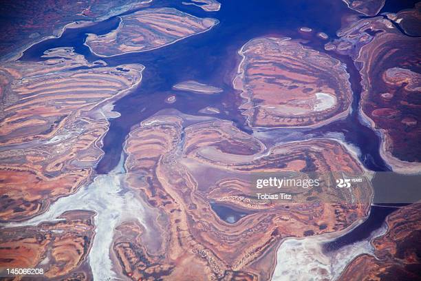
… and thus we had the brief … “Impressions of the Pilbara”.
Originally we talked about one piece (they wanted it about 5 feet long) but there were some practical issues with pouring that size of canvas, and transportation from East to West coast was also problematic. So we agreed on a triptych … each panel being 30 inches high and 20 inches wide, giving them their 5 foot overall width by 2.5 feet high when displayed.
I did numerous practice pours which (like the one concept they loved) came out completely by random each time! Some looked cool and some were, frankly, disastrous. However, with time and lots of practice, I worked out that although I couldn’t completely control the fluid nature of the pour, I could at least influence it.
I’ll admit that I procrastinated quite a bit over the doing the actual pour because unlike regular acrylic painting, where you can go back a finesse bits that aren’t good enough, it’s extremely difficult to alter a pour without destroying the fluid look. Several times while learning I ended up scraping off the paint and re-pouring completely.
By the time of the big day, I had perfected my pouring medium (a mix of de-mineralised water and Floetrol), mixed my paints, and layered up the paints in three 1 litre plastic jugs (one for each canvas) …. so I couldn’t put it off any longer and, with some trepidation, started the slow pours.
Amazingly, all three canvases came out reasonably to plan (as much as you can plan ‘fluid’) and the client was happy with the designs. Once the paint was fully cured (there’s a lot of paint in a pour so it takes several days) they were sprayed with protective lacquer, then boxed and shipped across the country.
They were installed in the boardroom this week and the client is over the moon that they perfectly met the brief (phew!).