Progress … isn’t always measured by the final result.

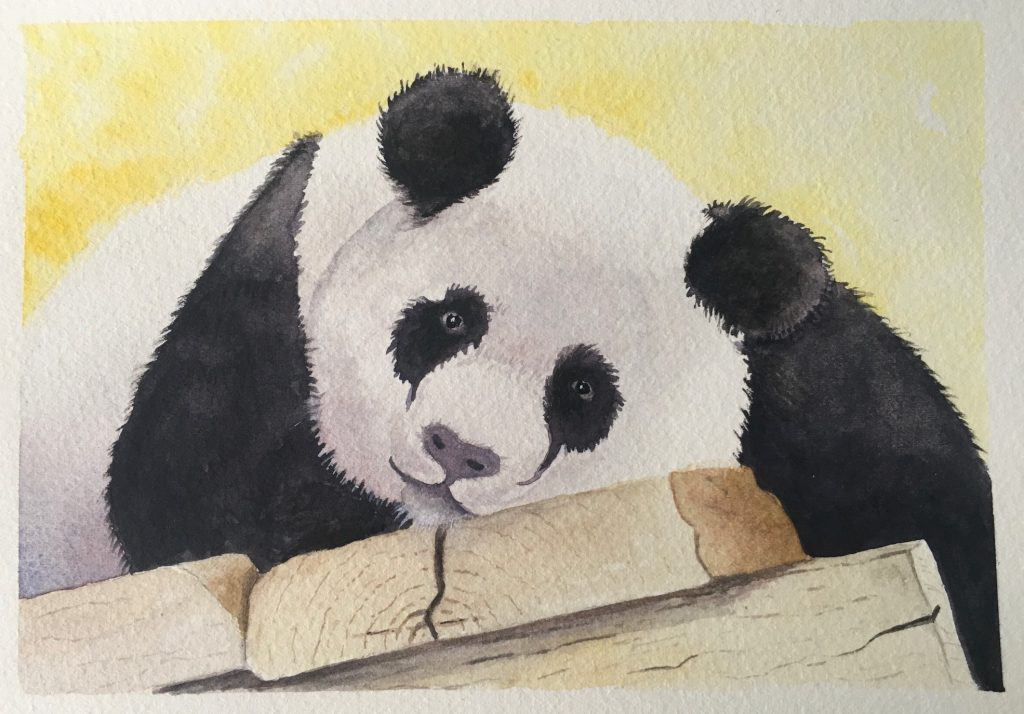
Panda tutorial from the Paint Wild Academy

This isn’t my best watercolour, but it represents a significant progress step in my watercolour journey. Just over 2 months ago, before I started with the Paint Wild Academy, this picture wouldn’t have been finished … so much went wrong … I would have ripped it from the board and would not have published it !

It started immediately. The very first strokes, the pale wash on the bottom left of the white fur (white is so often not white at all !) granulated and the mixed paint (the black is in fact a really strong dark purple based colour) separated in to red and blue.
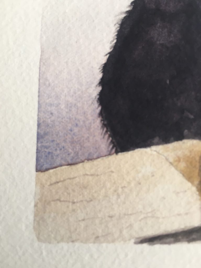
Next, I failed to flick out the tiny fur strokes on the left hand shoulder quickly enough. The watercolour had already started to dry and it created a horrible hard edge. Then I got the left hand ear wrong and it looked like a round pom-pom stuck on the panda’s head.

I was pretty happy how the wood was starting to look when I realised that I hadn’t looked at the refence picture for a while and I’d missed that the right hand end was in direct sunlight and actually had a strong highlight.

Previously I would have given up at this stage, got frustrated with how difficult watercolour can be some days and probably resorted to getting out a canvas and painting something in acrylics to renew my confidence.

However, three important things I’ve learnt from the Academy are:
1) paintings can go through an ugly stage (so stay with it)
2) there is artistic license (and your audience hasn’t seen the reference photo!)
3) it’s worth trying to fix it (what’s the worst that can happen …. you were going to rip it from the board anyway)
… so I ploughed on.

I decided the colour split granulation actually produced a reasonable effect so left it alone. I scrubbed the hard shoulder line and, while it is still visible in the picture, it is now much softer than it was. I reworked the ear so it followed a better shape (it is slightly larger now then the other ear but no longer looks like a pom-pom). I darkened the right hand side of the timber to make it look like a natural bark rather than bleached out by the sun.

The overall result was pretty good and, more than that, I demonstrated to myself that I’m making progress in my attempt to wrestle some control over this fickle medium.

To those that do, happy painting … and to those that just look, I hope the picture may have brought about a smile.

Sometimes we all need a bit of help

Watercolour Tiger
Painting produced using online video tutorial at paintwild.com

I’ve commented many times before that “I struggle with watercolour”.

I love the idea of the medium …. its softness, its transparency, but I find it a real struggle to control. If it’s not on the Hogwart’s Dark-Arts curriculum it should be! Too much, or too little water and you will not get the effect you want … and nobody can tell you how much water that is because it will be different for differing brands and weights of paper. Even different colour paints from the same brand can require different amounts of water because of differing pigment strengths … and don’t even mention the effect of the weather (especially in the Queensland summer humidity). It reminds me of my dear old late Mum’s recipe for Bread Pudding … there were no grams or ounces, just “a bit” of this and “a good shake” of that.

I’ve achieved some ok watercolour pieces in the past but sometimes they have been lucky outcomes, and I’ve never reached the stage where I truly feel in control with watercolour. It would be easy to give up on it and just focus on acrylics, which are definitely my comfort zone … it’s not as though I don’t enjoy painting with acrylics. However, I can be a persistent bugger (hey – who said stubborn!!) but I did feel like I was probably as far as I was going to get with the self taught approach. So I’ve just subscribed to an online year long tutorial group and, as I seem to so often paint animals, I went with one that specialises in wildlife (www.PaintWild.com)

This tiger was from the first tutorial. The tutor (an Australian called Emma Witte) does the painting real-time in the video, and provides the coloured reference photo, a black and white version (easier to see contrast values) and even provides an outline sketch that can be traced for anyone that doubts their drawing ability. I submitted my first draft which I was pretty happy with and received feedback from the tutor and from the more experienced painters in the group. In the past, when I’ve tried to fix my watercolour work after it has dried too much I’ve often created bigger issues (hard edges, blooms or back-runs, blotchy colours, etc.) but Emma introduced me to new techniques (like dry-brush scumbling) that enabled me to boost the colour and improve the tonal values without stuffing it up. Well that’s not entirely true … I did stuff up (an ear) but I was able to use some of the techniques to recover the situation.

The end result ? … well you can see for yourself in the picture. It’s not perfect, but from a technical perspective it’s probably the best watercolour I’ve ever done. I certainly feel like I learnt more through the first tutorial than I have from hours of looking at free YouTube stuff and I even felt in control of the paint … for most of the time.

Just goes to prove, we are need a little help from time to time.

Acrylic Pouring Art

This year I took on a commission to produce something for a Corporate Boardroom for a company in Perth WA. The client didn’t know what they wanted, other than it was to contain a lot of their Corporate colours, Orange and Blue (not ideal partners on the colour wheel !), for it to be “different” and for it “to lift the room”. I played around with a number of different concept ideas for them and, as a part of this, had my very first go at acrylic pouring art.

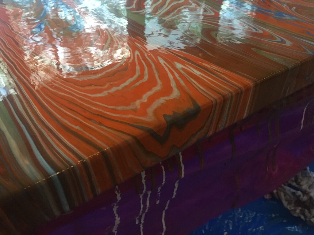
Acrylic pouring is a fluid painting technique. Basically, you ‘condition’ regular acrylic paint with some form of medium so that it becomes pour-able … sort of the consistency of runny honey.

Love the way that fluid pour ‘waterfalls’ over a deep edge canvas

You mix or layer colours before the ‘pour’ to create interesting designs. There are numerous methods for the actual pour – Basic ‘Clean’ Pour, Dirty Pour, Flip Cup, Dutch Pour, Swipe, Reverse Dip, Ring Pour and probably several others … which all create different effects.

I soon learnt that mixing the paint is part science and part Hogwarts’ Dark Arts ! Too thick and the pour doesn’t cover the canvas evenly (and tends to crack during drying); too thin and the colours bleed together to become a muddy mess; any inconsistency between your various colours can lead to some bleeding together and others remaining pure … which can be quite interesting but is very unpredictable.

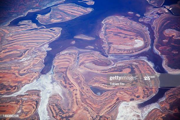
The client organisation are a wonderful crew that fly out to remote mine sites in WA to help manage the rehabilitation of injured mine workers. One of the first three concept examples I sent them had their entire office say “that reminds me of the view from the plane as you fly over the Pilbara region” …

Aerial photograph of the Pilbara region – Getty Images

… and thus we had the brief … “Impressions of the Pilbara”.

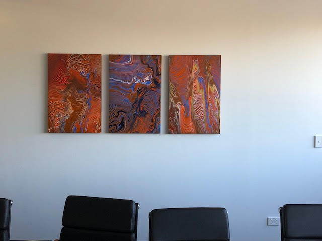
Originally we talked about one piece (they wanted it about 5 feet long) but there were some practical issues with pouring that size of canvas, and transportation from East to West coast was also problematic. So we agreed on a triptych … each panel being 30 inches high and 20 inches wide, giving them their 5 foot overall width by 2.5 feet high when displayed.

I did numerous practice pours which (like the one concept they loved) came out completely by random each time! Some looked cool and some were, frankly, disastrous. However, with time and lots of practice, I worked out that although I couldn’t completely control the fluid nature of the pour, I could at least influence it.

I’ll admit that I procrastinated quite a bit over the doing the actual pour because unlike regular acrylic painting, where you can go back a finesse bits that aren’t good enough, it’s extremely difficult to alter a pour without destroying the fluid look. Several times while learning I ended up scraping off the paint and re-pouring completely.

By the time of the big day, I had perfected my pouring medium (a mix of de-mineralised water and Floetrol), mixed my paints, and layered up the paints in three 1 litre plastic jugs (one for each canvas) …. so I couldn’t put it off any longer and, with some trepidation, started the slow pours.

Amazingly, all three canvases came out reasonably to plan (as much as you can plan ‘fluid’) and the client was happy with the designs. Once the paint was fully cured (there’s a lot of paint in a pour so it takes several days) they were sprayed with protective lacquer, then boxed and shipped across the country.

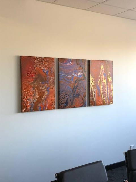
They were installed in the boardroom this week and the client is over the moon that they perfectly met the brief (phew!).

Impressions of the Pilbara – installed in boardroom
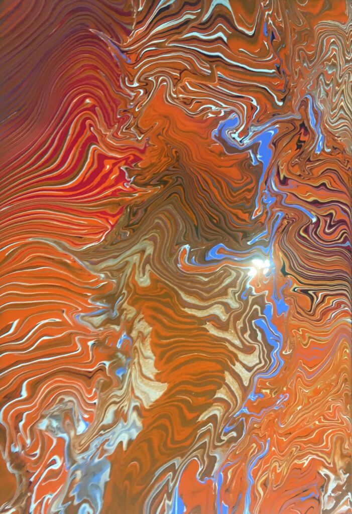
Close up detail of one canvas

Mood driven painting

I haven’t posted on the blog for some months and, actually, I haven’t done much painting. The original intention of this blog was to share the ‘journey’ of taking up painting in retirement, so here goes with quite a personal one.

As those who know me well will already be aware, the wife and I returned from the seeing her elderly parents in the UK, in December 2019. Sadly, we hadn’t been home many days when we heard that her Dad had passed away. So, Christmas Day we were back on the plane, headed for the UK, for the funeral and to help sort out affairs for her Mum there.

Being away for several weeks I had no chance to paint, but I found also that I had no desire to. Even when we got back home in February, it was some time before I went to my ‘studio’ (the converted bedroom!). As I have said many times, I paint for fun … because it makes me smile… and what I’ve come to realise is, that I have to be in that frame of mind, or mood, to do it.

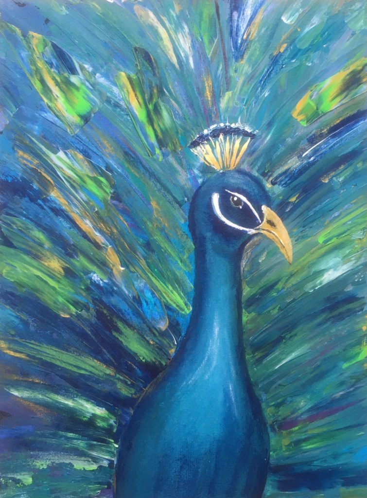
My father-in-law’s surname was Peacock, so it only seemed fitting that my first painting after picking up the brushes again was, of course, ….

Semi-abstract Peacock – In memory of Angus

It’s clear to me that, even though it was time to pick up the paint brushes again, the ‘fun’ mood hadn’t completely returned. To me, this feels quite a sad painting … it certainly lacks the amusing, or comedic, element that I normally strive for.

However, as anyone that has suffered the loss of a loved one knows, the grieving process takes time and each day you heal a little bit more. I have a corporate commission to do (that I have put off for far too long!) but I think before I do that I must paint an Eric, of something else fun, to get that sense of ‘smile’ back in to my art. I’m confident that the right mood will return, so watch this space.

Wherever you are around the world, stay safe in these troubled times.

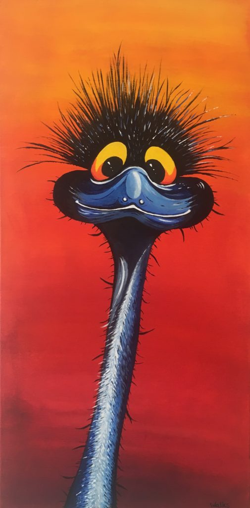
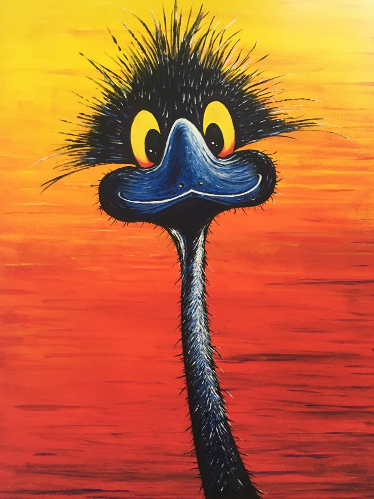
How long does it take to paint Eric the Emu? … Where do you start?

I’m often asked ‘how long it takes to paint a picture of Eric?’ … and there is no easy answer to that. It is hugely dependent upon the canvas size and level of detail … and then do you mean how long ‘actually painting’, or the entire process? You see there is necessary ‘wait’ time in the process. For example, when I’ve laid down a background for Eric I have to let that dry before I can start painting the character … otherwise there is a potential for a muddy coloured mess!

I’m also asked ‘how do you even start? Do you sketch in pencil first?’. That one’s much easier … I did sketch the shape for the very first Eric but since then, I just start painting an outline freehand with the brush.

I’ve just done a version of Eric for a UK customer (this one is off to keep Dame Edna Emu company in Surrey) which was A4 size on acrylic paper. Physical painting time of this one was a little over 5 hours … but you can view the process of how I build up the picture in a mere 56 seconds.

Eric the Emu …. in 56 seconds

The story of Eric the Emu

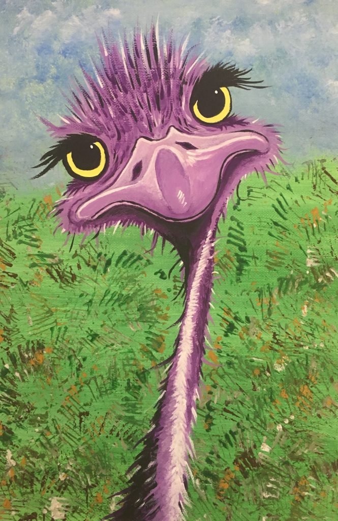
I’ve always loved the classic comedic emu pictures which are so prevalent in Australia. In fact we have a wonderful piece of emu art in our home, produced by Muz of Eumundi, which always makes me smile when I look at it.

Emus by Muz

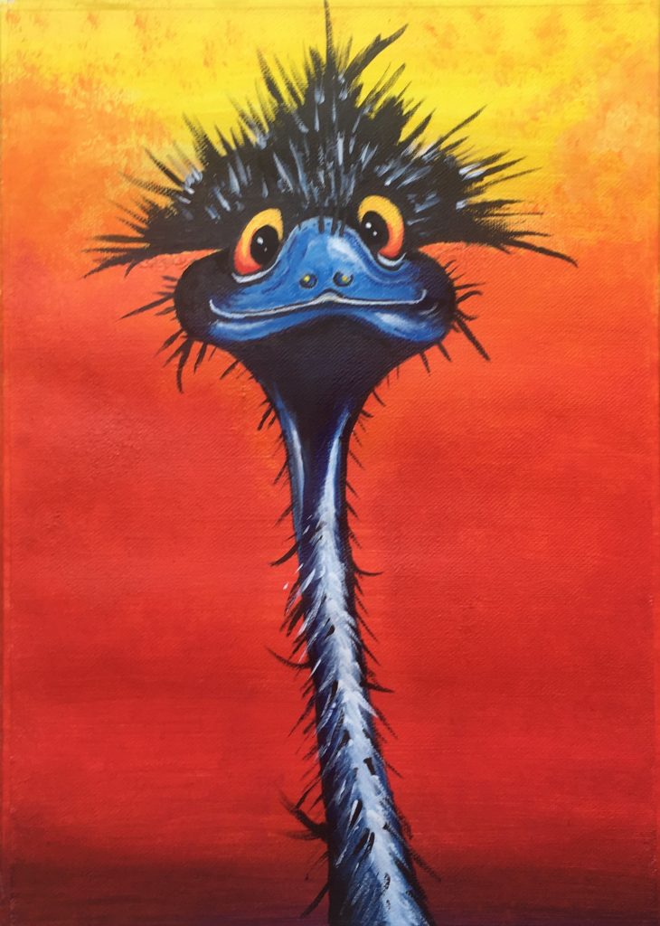
So, after researching a swag of images on pinterest, I had a go at my own version and ‘Eric the Emu’ was born on the 16th March 2019. This first Eric was painted in Acrylics just on an A4 piece of 245gsm Canson Acrylic Sketch paper.

Eric v1.0

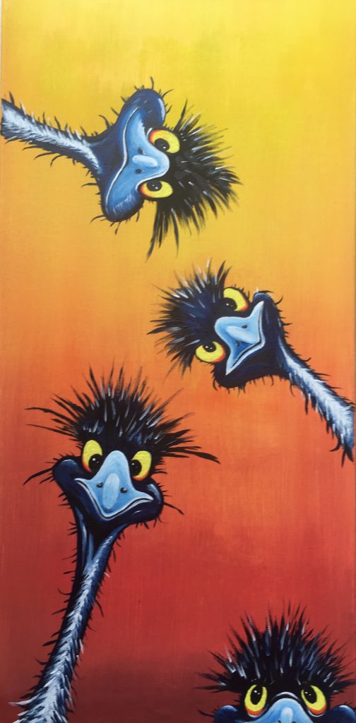
Obviously Eric needed some friends, so along came ‘Eric and his mates’ a week or so later.

24 x 12 inch – Acrylic on canvas

Producing a single Eric on the larger canvas size meant more detail could be added.

Eric v3.

As a bit of fun, I did a female version and posted it on Facebook, telling my friends that it was a competition and whoever gave me the best name for Eric’s ‘love interest’ would win the picture as a prize. The responses were overwhelming and after much deliberation ‘Edna’ (as in Dame Edna Emu) was crowned.

Dame Edna Emu

Edna now resides in a home in Cheam in the UK!

So what’s next for Eric …. well, I have just done a much larger 60cm x 50cm canvas (see below) to explore the possibility of producing a numbered, limited edition, print run for sale. Watch this space for for more information, and if you might be interested in a copy drop me a message through the website.

Latest version of Eric

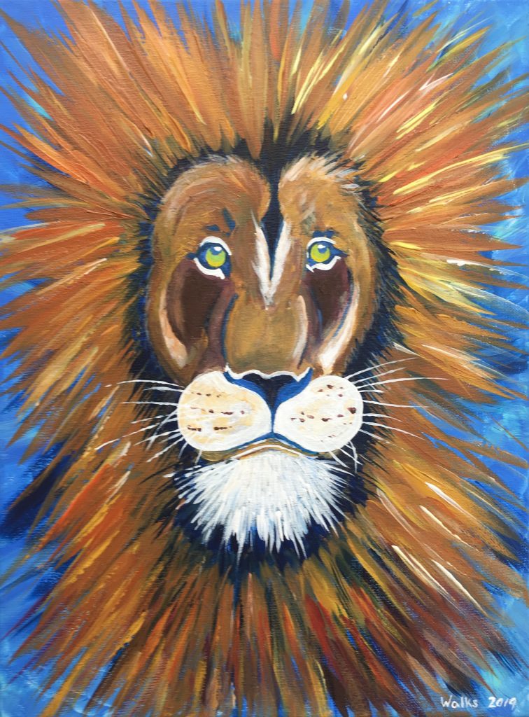
Leo the Lion …. now sold

It took me quite a while to sell my first painting. It wasn’t so much the lack of offers, as a few friends enquired as soon as I started to share my pictures on Facebook, but more a sort of emotional attachment to the art … created due to the time and effort that goes in to a piece. However, eventually I got to the stage where I was struggling to find places in the home to hang pieces and I realised that I was going to have to let some go. The process was aided by a good friend (and old business mentor) in Chicago … and hence the very first sale , ‘Arthur’ went to the USA.

SOLD “Arthur” – June 2019

It’s now hanging in his corporate office and I get regular messages that it has become a bit of talking point with visitors and that it makes many people smile. This is wonderful to hear, as my whole inspiration to paint is to have some fun and if that translates in to making others smile too, I’m a very happy guy.

Letting go of Arthur released the shackles and hence when a local friend approached me asking about Leo the Lion, it was no longer a problem to agree to part with him … especially as that’s her star sign! So goodbye Leo … I have loved having you on display in my art room, but it’s time for you to make someone else smile every day.

SOLD Sept 2019. Leo the Lion - June 2019
SOLD Sept 2019 Leo the Lion – June 2019

Did you know that you could paint?

When I tell people that I started painting when I retired, at the ripe old age of 57, people often ask “Did you know you could paint?”

The quick and easy answer is that everyone can paint … it’s just whether you think your paintings are good enough to show other people! I freely admit that I only publish pictures that I’m happy with (or at least reasonably happy with). There are many that do not make the grade; they are either destroyed or I paint over the canvas with another test piece.

The more accurate answer is … well, I knew that I used to be able to draw and colour reasonably well. I think I was 12 or 13 when I received a gift of a sketch pad, a ‘how to draw animals’ book and some pencils and an eraser … and it started from there. I used to draw as a teenager. I found the old sketchbook recently and it’s clear that I drew things that interested me at that age … like rally cars.

After leaving school, starting work, getting married and having kids, there just never seemed to be time for drawing, so it just sort of unconsciously stopped. I did the very occasional piece, like a copy of some characters from one of my daughter’s favourite books when she was young to hang in her bedroom, but it’s probably fair to say that when I started to paint it had been well over 30 years since doing any drawing.

So, did I know that I could paint? … no, not really … but like everything in life, you never know unless you give it a go.

I’d encourage anyone to try … the satisfaction when a piece turns out well is awesome. You just need to persevere long enough to give it a chance to work …. unless you are an absolute natural, it takes time to learn. There are lots of educational videos on YouTube that can get you started so why not give it a go.

With art particularly, it’s also important to try different mediums. I’ve found that my comfort zone is acrylics and I struggle to manage to control watercolours on the paper (although I refuse to give up on them). Your niche might be different … oils, pastels, or mixed media … just don’t give up too easily.